APInf Information Dashboard design brief
This document is meant serve as a common basis for understanding the scope and purpose of the APInf Information Dashboard.
Intent
The APInf Information Dashboard is intended to help APInf stakeholders (end-users) gain an awareness/understanding of their current situation at any given point in time through the use of data visualisation.
Key concepts
In order to agree on what to build, it is important to define basic terminology. That way, our conversation can share a common vocabulary. Shared definitions of key concepts will also give our team a basis to evaluate any proposed designs/solutions.
Information Dashboard
A dashboard is a visual display of the most important information needed to achieve one or more objectives, consolidated and arranged on a single screen so the information can be monitored at a glance.
-- Stephen Few "Dashboard Confusion." Intelligent Enterprise
Dashboards often provide at-a-glance views of KPIs (key performance indicators) relevant to a particular objective or business process
-- Wikipedia contributors. "Dashboard (business)." Wikipedia, The Free Encyclopedia. Wikipedia, The Free Encyclopedia, 4 Apr. 2017. Web.
All dashboards should display a quantitative analysis of what is going on with immediacy and intuitiveness.
-- Hetherington, V. (September 23). The Dashboard Demystified: What is a Dashboard? Retrieved June 02, 2009
the dashboard should provide all the information that the user needs for a specific analysis in front of his or her eyes.
Choudhury, Shilpi. "Four Cognitive Design Guidelines for Effective Information Dashboards." UX Magazine. N.p., 18 June 2014. Web. 15 June 2017.
The APInf Dashboard Design Working Group came up with the following concepts we believe define the concept of a Dashboard:
- one view
- at-a-glance understanding with no/minimal scrolling
- show the big picture
- overview
- synthesis
- allow user to get to deeper levels (of data/understanding)
- enhance contextual awareness
- show things that need immediate attention
- suggest appropriate action
Related resources: - What is a Dashboard? - What is a data dashboard?
Data visualisation
[Data visualisation is] the representation and presentation of data in order to facilitate understanding
-- Kirk, A. (2016). Data visualisation: a handbook for data driven design. Los Angeles: Sage Publications.
We are wired for visualization.
UX Magazine: Four Cognitive Design Guidelines for Effective Information Dashboards
Situation awareness
[Situation awareness] is informed by a particular set of facts that add up to an overview of the situation. People want those facts to be readily avaiilable, displayed in a way that makes them easy and efficient to percieve, understand, and if necessary, respond. That display is a dashboard.
-- Few, S. (2013). Information dashboard design: displaying data for at-a-glance monitoring. Burlingame, CA: Analytics Press.
Principles
Rules are for practitioners who don’t really know the value of this process, while principles demand wisdom and maturity.
-- Viviano, Anthony. "The Lean UX Manifesto: Principle-Driven Design." Smashing Magazine. N.p., 8 Jan. 2014. Web. 12 June 2017.
Several core principles can guide the design process.
Three Principles of Good Visualization Design
Good data visualization is - trustworthy - accessible - elegant
-- Kirk, A. (2016). Data visualisation: a handbook for data driven design. Los Angeles: Sage Publications.
Circumstances
Defining your project's circumstances involves identifying all the requirements and restrictions that are inherited by you, imposed on you or determined by you.
-- Kirk, A. (2016). Data visualisation: a handbook for data driven design. Los Angeles: Sage Publications.
People
- Who are the project's primary stakeholders?
- What levels of expertise might our users have?
- What information might our stakeholders need to access?
- How might users be able to adjust the dashboard to meet their individual needs?
We explored the above questions during a workshop (on 12.06.2017), and came up with the following personas/needs:
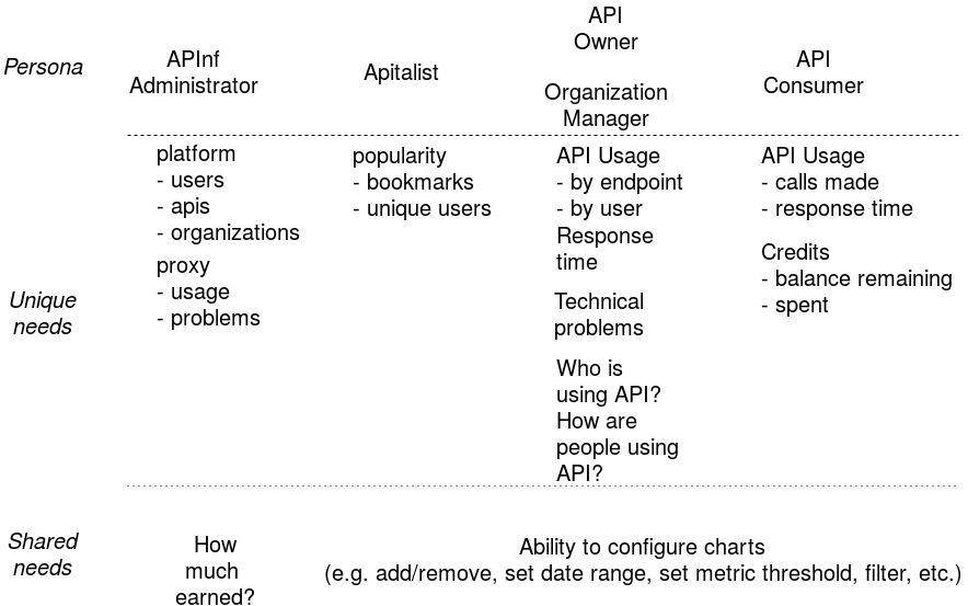
Additional notes from in-house discussions:
- API/Organization owner needs to see
- errors/problems at a glance (particularly red error flags)
- problems are on top of list
- access details view on demand
Constraints
- What are some limitations of this project?
- What are the time constraints?
After a brief, and slightly difficult, discussion, we came up with the following constraints:
- we are a small team
- we are dependent on existing solutions
- e.g. data sources/structure not always determined by us
- we have a short time to complete this project (aprox. 1 month)
- one sprint for basic design/implementation
- one sprint for testing and user feedback
Consumption
- How will people access this project?
- What (basic) screen sizes, and other media will they use to perceive the visualizations?
Deliverables
- What types of output, or deliverables, will we produce during the design/development process? E.g.
- dashboard project design brief
- new/improved proto-personas
- user journey/storyboards
- wireframes/paper prototypes
- user feedback (interviews, survey results)
- HTML mock-ups
- prototype web application
- improvements to/revitalization of dashboard implementation
Resources
- What types of skills do we have available as a team?
- How much time does each member of the team have to commit to the completion of this project?
Purpose
When setting out to design a dashboard, we must, before anything else, clearly define the dashboard's purpose.
-- Few, S. (2013). Information dashboard design: displaying data for at-a-glance monitoring. Burlingame, CA: Analytics Press.
Discussion questions
- Why are we building this dashboard/data visualisation?
- What are we trying to accomplish with this dashboard?
- What does a successful outcome of using the dashboard look like?
Goals
the user and their goals often become lost in the lengthy debates over features, designs, and implementations. Empathy is at the heart of great products and services.
-- Gothelf, Jeff, and Josh Seiden. "Running the Exercise: User Outcomes." Lean UX: Applying Lean Principles to Improve User Experience. Beijing: O'Reilly, 2016.
to design an effetive dashbard, we must get into the clients' minds and examine the mental models for the activities that the dashboard will help them monitor.
-- Few, S. (2013). Information dashboard design: displaying data for at-a-glance monitoring. Burlingame, CA: Analytics Press.
[the goal of] data visualisation is to facilitate understanding.
-- Kirk, A. (2016). Data visualisation: a handbook for data driven design. Los Angeles: Sage Publications.
Based on user interviews (in-house employes chosen to represent customer roles), we have identified several user goals.
High-level goals
At a high level, at least the following categories of understanding are important:
- errors and trouble
- performance (latency, traffic, etc.)
- errors
- stability (rapid changes, patterns, outages, etc.)
- broken user management (authentication)
- patterns and trends over time
- compare historic values
- spikes, dips, limits, special cases (outliers), common values (mean/median)
Important details
Several specific details would be useful to see:
- which API needs immediate attention
- problematic APIs appearing on top of the list
- see a quick number of APIs that need immediate action before seeing the overview
- downtime (current and past)
- number of calls
- the number of failed calls
- see failed/error/slow calls
- average response time
- unique users (possibly by API key)
- unique user may be needed for a specific API only
- some APIs may not have need for unique users
- the correlation between response time and failed calls
- details about slow/failed/error calls and their time for a parcitular API
- details such as HTTPS handshake durations, DNS lookup duration, etc. might be needed
- how happy the customers are
- i.e. average rating? number of feedback reports?
- how popular API grows among users
- number of unique users
- number of bookmarks (see who follows API)?
- number of visits to API Profile?
Useful capabilities
The following abilities might be useful to one or more of our hypothetical user roles:
- filter the APIs displayed
- use the url to show developers where the problem is
- automatic refresh of chart data (i.e. real-time dashboard)
- show data that is updated in 5 minutes or less (as real time or possible)
- real time data is more important for monitoring information (e.g. errors and alerts)
- historic data (e.g. daily, weekly, or monthly aggregations) for showing trends, changes, spikes, etc. over time
- weekly aggregations: from now until the same time in previous week
- montly aggregations: from now until same time one month ago (30 days?)
- indications about things that need attention
- try not to overcrowd the display
- colors are useful to indicate status of an API (for users who can differentiate red from green)
- indications should be color coded to notify whch is a positive (interpreted as 'good') change and which is not
- manually configure overview information that would be appearing for each API
- e.g. number of calls, avg. response time, unique users, etc.
- set threshold values to [filter] a specific metric (especially for avg. response time)
- visual indicator if any of the metric values exceeds some predefined threshold
- numbers should be the main thing to get focus (1st glance)
- try to keep user in one context (i.e. no navigation, or change in view)
- helps user stay 'oriented'
- no need to fetch and repopulate all the data
- see metrics for individual endpoints (not just at the 'API' level of aggregation)
- ability to select specific timeframe
- e.g. specific week, month, year from historic data
- possibly a date picker with start and end dates
- responsive user interface
- consider complexity of choosing metaphorically correct icons
- prefer text descriptions
- icons may be confusing
- get all possible data for an API
- might want to predict the next (abnormal) rise/fall of any metrics
Vision
What you need to consider here is what can you envision being the most suitable type(s) of visualisation that might be most capable of accomplishing what you intend.
-- Kirk, A. (2016). Data visualisation: a handbook for data driven design. Los Angeles: Sage Publications
Discussion questions
- What will it look like for someone to use this information dashboard?
- How will it improve their work, life, etc.?
- What would be a basic narrative of one or more people as they interact with the dashboard?
- How can we design the dashboard to help people achieve their desired goals and outcomes?